Graphing with matplotlib
Today I wanted to draw some graphs. I started out using Wolfram Alpha’s excellent plot() functionality but wanted something that I would be able to use offline too. Mathematica & Matlab are beyond my requirements and Excel/Google Sheets/the Apple one don’t give me enough flexibility.
I chose to use Python and in particular the matplotlib library’s pyplot module. I don’t really use Python so before I talk about how I got basic graphs working, let’s look at getting Python set up on OSX:
Python Setup
As Python 3 is the latest official version, we should try to use that if possible. The quickest way to get that is by installing it with brew:
brew install python3
To verify this has worked, start a new terminal session and run python3. You should now see something like this:
python3
Python 3.4.3 (default, Aug 11 2015, 08:57:25)
[GCC 4.2.1 Compatible Apple LLVM 6.1.0 (clang-602.0.53)] on darwin
Type "help", "copyright", "credits" or "license" for more information.
>>>
The default brew Python 3 installation includes the pip package manager. As with the python executable, pip is suffixed with ‘3’ to distinguish it from a pip installation for python 2. You can verify its presence by querying its version:
pip3 --version
pip 7.1.2 from /usr/local/lib/python3.4/site-packages (python 3.4)
Basic Graphing
We need the matplotlib library which we can install with pip:
pip3 install matplotlib
Now we’re ready to make some graphs in Python! This is the script I used to draw my graphs:
import matplotlib.pyplot as plt
from cmath import log
from math import pow

test_data = list(filter(
                lambda x: x != 0,
                [n / 100.0 for n in range(-1000, 1001)]))

equations = [
     (lambda x: 1),
     (lambda x: x),
     (lambda x: pow(x, 2)),
     (lambda x: pow(x, 3)),
     (lambda x: pow(x, 4)),
     (lambda x: log(x).real)
]

plt.axhline(0, color='black')
plt.axvline(0, color='black')
plt.xlim((-10, 10))
plt.ylim((-10, 10))

for equation in equations:
    plt.plot(test_data, list(map(equation, test_data)))

plt.savefig("out.png")
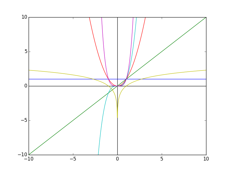
In this example, I want to run a series of equations of the form y = f(x) so I need to create some x values for the data points and then have some way of representing the equations.
I want my x values to go from -10 to 10 so I first tried range(-10, 11), but this only gives me a granularity of 20 coordinates. Instead I used a for comprehension - creating a range from -1000 up to and including 1000, and then dividing each coordinate by 100 which results in 2000 floating point x values between -10 and 10.
I create several lambdas representing equations (y = 1, y = x, y = x^2, y = x^3, y = x^4, y = log(x)) and stash these in an array. I want to use the complex logarithm for which y values exist for negative x, but not for 0 so at this point I exclude 0 from my test_data using the filter function and a lambda predicate.
Setting up the graph layout is simple - I add lines through the origin with the axhline and axvline functions and set the limits of the graph to positive and negative 10 for both axes with xlim and ylim.
To plot the graphs, I iterate over the array of equation lambdas and plot the test data against the test data mapped to the current lambda. Finally I output the graph to a file called “out.png” with the savefig function:
Bonus 1: Atom Setup
I like the Atom editor, and it comes with support for Python out of the box. However, there are two extra packages that make Python editing nicer for a beginner like me. These are autocomplete-python which provides autocompletion functionality as you might expect, and linter-pep8 which applies the pep8 standards tool to your code and tells you when you’re not formatting it in the correct way.
First you need pep8:
pip3 install pep8
And then you need to install the packages which you can either do through the Atom UI, or with the Atom Package Manager as follows:
apm install autocomplete-python linter-pep8
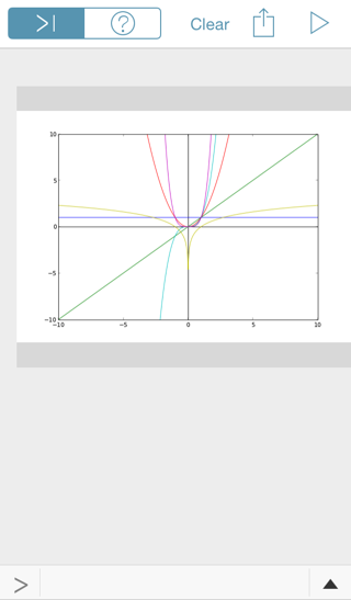
Bonus 2: Pythonista
There exists a splendid iOS app called Pythonista which contains an implementation of Python and a well featured editor. Pythonista also comes packaged with matplotlib, so out of curiosity I copied my graph script in, changing the plt.savefig("out.png") line to plt.show() to display the graph rather than write it to a file, and it worked straight away:blo