A Metal Renderer in Swift Playgrounds (Part 6)
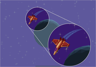
A quick recap - I have a voxel spaceship orbiting a distinctly low poly planet and it looks a bit odd. Making low poly models on an iPad is hard because the tools available basically aren’t Blender (or are prohibitively expensive subscriptions at my price point). So I’m seeing if there’s a way to reconcile voxels and low poly models in a way that isn’t terrible.
Pixelating Filter
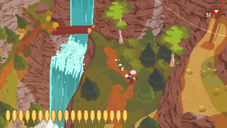
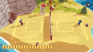
I recently played a game that I really enjoyed called A Short Hike. I found the gameplay excellent - casual but with enough depth to keep me interested, and the story and characters were genuinely lovely. However the reason I mention it is the art style. It has a cute low-poly style combined with a pixelated filter and posterized shading, and the aesthetic is absolutely beautiful to my VGA-era eyes. That’s not to say it’s trying to be retro as such - clearly the 3d technology didn’t exist when resolutions were necessarily that low, but whatever it is, it works incredibly well. Look at these screenshots… beautiful.
I wondered if some aspects of the look achieved by A Short Hike might coincidentally solve my problem: specifically by masking the difference between the polygons and voxels with a low resolution, as well as it fitting into a visual aesthetic that I rather enjoy. Of course, since I’m doing it more because of constraint than pure artistic vision it could well look terrible in my game.
How can I do this? My approach was to use offscreen rendering to first render the scene to a low resolution texture, and then draw this texture to a fullscreen quad, using a nearest filter to ensure that the pixels weren’t blurred. I played with the resolution and found 320x240 to be a good size. I don’t think any device these days uses a 4:3 aspect ratio so I scaled the height based on the ratio of the screen width to 320. This worked as expected, but the stars in particular looked really jagged as the camera rotated.
Anti-Aliasing
In an attempt to address the jaggedness I introduced multisample anti-aliasing. Metal makes this really easy - you can create a multisampling texture specifying the number of samples and configure the renderpass to take multiple samples to that texture and resolve the samples into an output texture. In my case, the output texture was the existing offscreen rendering texture.
Adding anti-aliasing had the effect of… adding anti-aliasing and I liked how it looks, but the billboarded stars still looked terrible. I realised that even with multisampling, the diffraction spikes of the star (which, incidentally, make no sense outside the context of a mirrored telescope with support beams, but let’s breeze past that) were so thin that the texture sampling in the star’s shader was not picking them up consistently at such a low resolution.
The solution was to calculate mipmaps for the generated star texture. This resolved the issue and the scene now featured the desired combination of pixelated anti-aliasing, giving a retro vibe and hiding the jagged voxels with jagged pixels. I added a second, more numerous type of star which used a simple white rectangular mesh, billboarding them in the same way as the larger stars.
Putting it all together
While doing this I also made the world more visually interesting by adding a ring to the planet. I did this by creating a mesh made up of a configurable number of segments with configurable radii. The ring was positioned at the same location as the planet, tilted at a jaunty angle, and was partially transparent, thus initiating the “enable alpha blending” dance. I added a couple more of these with different inner and outer radii and colours.
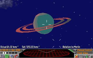
The planet bears a striking resemblance to the gas giant “Merlin” from the Ross 154 starting scenario in Elite 2: Frontier. This was unintentional but made me smile, as I enjoyed playing Frontier as a child and it has clearly made a lasting impression.


